Compare data from the Disdrometer and Rain Gauge
Contents
Compare data from the Disdrometer and Rain Gauge
import xarray as xr
import hvplot.xarray
import hvplot.pandas
import pandas as pd
import holoviews as hv
from distributed import Client, LocalCluster
hv.extension('bokeh')


Spin up a Dask Cluster
cluster = LocalCluster()
client = Client(cluster)
client
distributed.diskutils - INFO - Found stale lock file and directory '/Users/mgrover/git_repos/SAILS-radar-analysis/notebooks/precipitation-exploration/dask-worker-space/worker-ir4zk1dc', purging
distributed.diskutils - INFO - Found stale lock file and directory '/Users/mgrover/git_repos/SAILS-radar-analysis/notebooks/precipitation-exploration/dask-worker-space/worker-xti6v0kt', purging
distributed.diskutils - INFO - Found stale lock file and directory '/Users/mgrover/git_repos/SAILS-radar-analysis/notebooks/precipitation-exploration/dask-worker-space/worker-z1_b971u', purging
distributed.diskutils - INFO - Found stale lock file and directory '/Users/mgrover/git_repos/SAILS-radar-analysis/notebooks/precipitation-exploration/dask-worker-space/worker-9gganotb', purging
Client
Client-c0f4f414-b03e-11ec-975c-acde48001122
| Connection method: Cluster object | Cluster type: distributed.LocalCluster |
| Dashboard: http://127.0.0.1:8787/status |
Cluster Info
LocalCluster
91e9e044
| Dashboard: http://127.0.0.1:8787/status | Workers: 4 |
| Total threads: 12 | Total memory: 16.00 GiB |
| Status: running | Using processes: True |
Scheduler Info
Scheduler
Scheduler-f9e46403-61c0-4ba0-b98b-8c522987e89c
| Comm: tcp://127.0.0.1:51993 | Workers: 4 |
| Dashboard: http://127.0.0.1:8787/status | Total threads: 12 |
| Started: Just now | Total memory: 16.00 GiB |
Workers
Worker: 0
| Comm: tcp://127.0.0.1:52007 | Total threads: 3 |
| Dashboard: http://127.0.0.1:52008/status | Memory: 4.00 GiB |
| Nanny: tcp://127.0.0.1:51997 | |
| Local directory: /Users/mgrover/git_repos/SAILS-radar-analysis/notebooks/precipitation-exploration/dask-worker-space/worker-0t99hgjl | |
Worker: 1
| Comm: tcp://127.0.0.1:52010 | Total threads: 3 |
| Dashboard: http://127.0.0.1:52011/status | Memory: 4.00 GiB |
| Nanny: tcp://127.0.0.1:51998 | |
| Local directory: /Users/mgrover/git_repos/SAILS-radar-analysis/notebooks/precipitation-exploration/dask-worker-space/worker-tucc5a43 | |
Worker: 2
| Comm: tcp://127.0.0.1:52013 | Total threads: 3 |
| Dashboard: http://127.0.0.1:52014/status | Memory: 4.00 GiB |
| Nanny: tcp://127.0.0.1:51999 | |
| Local directory: /Users/mgrover/git_repos/SAILS-radar-analysis/notebooks/precipitation-exploration/dask-worker-space/worker-_kxqfpi5 | |
Worker: 3
| Comm: tcp://127.0.0.1:52004 | Total threads: 3 |
| Dashboard: http://127.0.0.1:52005/status | Memory: 4.00 GiB |
| Nanny: tcp://127.0.0.1:51996 | |
| Local directory: /Users/mgrover/git_repos/SAILS-radar-analysis/notebooks/precipitation-exploration/dask-worker-space/worker-z8evlhqf | |
Read in the data
Here, we use data from:
a disdrometer (datastream:
gucldM1.b1)a rain gauge (datastream:
gucwbpluvio2M1.a1)
We use all the data available, you can query from this website: https://adc.arm.gov/discovery/#/
disdrometer_ds = xr.open_mfdataset('../../data/disdrometer/*')
gauge_ds = xr.open_mfdataset('../../data/rain-gauge/*')
Visualize the Data
We use hvplot here to plot an interactive view of our data, utilizing rasterize to dynamically view our large datasets
from bokeh.models import DatetimeTickFormatter
def apply_formatter(plot, element):
plot.handles['xaxis'].formatter = DatetimeTickFormatter(hours='%m/%d/%Y \n %H:%M',
minutes='%m/%d/%Y \n %H:%M',
hourmin='%m/%d/%Y \n %H:%M',
days='%m/%d/%Y \n %H:%M',
months='%m/%d/%Y \n %H:%M')
disdrometer_precip_rate = disdrometer_ds.where(disdrometer_ds.qc_precip_rate == 0).precip_rate.compute()
gauge_precip_rate = gauge_ds.where(gauge_ds.pluvio_status == 0).intensity_rtnrt.compute()
gauge_precip_rate.attrs['long_name'] = disdrometer_precip_rate.attrs['long_name']
gauge_precip_rate['name'] = disdrometer_precip_rate.name
max_precip = 50
disdrometer_rate_plot = disdrometer_precip_rate.hvplot.line(ylim=(0, max_precip),
label='Disdrometer',
rasterize=True,
xlabel='Date/Time',
title='Disdrometer (gucldM1.b1)').opts(hooks=[apply_formatter])
bucket_rate_plot = gauge_precip_rate.hvplot.line(ylim=(0, max_precip),
rasterize=True,
label='Rain Gauge',
xlabel='Date/Time',
title='Rain Gauge (gucwbpluvio2M1.a1)').opts(hooks=[apply_formatter])
View our Final Visualization
We can combine these into a single column of plots, matching the views/colorbars
(disdrometer_rate_plot + bucket_rate_plot).cols(1)
Look for Periods of Precip
We use this example of looking for periods above a threshold in pandas - https://stackoverflow.com/questions/55014867/pandas-threshold-data-sequence-based-on-the-length-of-pattern
The main steps here are:
convert our data to a dataframe
mask of records above baseline (precipitation rate > 0)
label groups of sequenced positive values
check the size of each sequence group
filter values that are positive and the sequence size is lower than n time (minutes)
determine an “event threshold” value (in minutes)
determine an event as one of these occurences
Convert to a pandas.DataFrame
Convert our Rain Gauge Data to a pandas.DataFrame
For this exercise, we will use a pandas.DataFrame instead of an xarray.Dataset
df = pd.DataFrame({'gauge_precip':gauge_precip_rate.values},
index=gauge_precip_rate.time.values)
Filter for Positive Precipitation Values
masked_gauge = df > 0
masked_gauge
| gauge_precip | |
|---|---|
| 2021-04-23 17:55:00 | False |
| 2021-04-23 17:56:00 | False |
| 2021-04-23 17:57:00 | False |
| 2021-04-23 17:58:00 | False |
| 2021-04-23 17:59:00 | False |
| ... | ... |
| 2022-03-29 20:55:00 | False |
| 2022-03-29 20:56:00 | False |
| 2022-03-29 20:57:00 | False |
| 2022-03-29 20:58:00 | False |
| 2022-03-29 20:59:00 | False |
428505 rows × 1 columns
Separate our data based on consecutive, non-missing values
sequence_groups = abs(masked_gauge.astype(int).diff(1).fillna(0)).cumsum().squeeze()
sequence_groups
2021-04-23 17:55:00 0.0
2021-04-23 17:56:00 0.0
2021-04-23 17:57:00 0.0
2021-04-23 17:58:00 0.0
2021-04-23 17:59:00 0.0
...
2022-03-29 20:55:00 9978.0
2022-03-29 20:56:00 9978.0
2022-03-29 20:57:00 9978.0
2022-03-29 20:58:00 9978.0
2022-03-29 20:59:00 9978.0
Name: gauge_precip, Length: 428505, dtype: float64
Use Groupby to bin our groups, and transform back to the dataframe
sequence_size = masked_gauge.groupby(sequence_groups).transform(len)
sequence_size
| gauge_precip | |
|---|---|
| 2021-04-23 17:55:00 | 20032 |
| 2021-04-23 17:56:00 | 20032 |
| 2021-04-23 17:57:00 | 20032 |
| 2021-04-23 17:58:00 | 20032 |
| 2021-04-23 17:59:00 | 20032 |
| ... | ... |
| 2022-03-29 20:55:00 | 261 |
| 2022-03-29 20:56:00 | 261 |
| 2022-03-29 20:57:00 | 261 |
| 2022-03-29 20:58:00 | 261 |
| 2022-03-29 20:59:00 | 261 |
428505 rows × 1 columns
Merge our filters into a single dataframe
Currently, these groups/checks are in separate dataframes - let’s bring these together!
df_extended = pd.concat([df, masked_gauge, sequence_groups, sequence_size], axis=1)
df_extended.columns = ['value', 'is_positive', 'sequence_group', 'sequence_size']
df_extended
| value | is_positive | sequence_group | sequence_size | |
|---|---|---|---|---|
| 2021-04-23 17:55:00 | 0.0 | False | 0.0 | 20032 |
| 2021-04-23 17:56:00 | 0.0 | False | 0.0 | 20032 |
| 2021-04-23 17:57:00 | 0.0 | False | 0.0 | 20032 |
| 2021-04-23 17:58:00 | 0.0 | False | 0.0 | 20032 |
| 2021-04-23 17:59:00 | 0.0 | False | 0.0 | 20032 |
| ... | ... | ... | ... | ... |
| 2022-03-29 20:55:00 | 0.0 | False | 9978.0 | 261 |
| 2022-03-29 20:56:00 | 0.0 | False | 9978.0 | 261 |
| 2022-03-29 20:57:00 | 0.0 | False | 9978.0 | 261 |
| 2022-03-29 20:58:00 | 0.0 | False | 9978.0 | 261 |
| 2022-03-29 20:59:00 | 0.0 | False | 9978.0 | 261 |
428505 rows × 4 columns
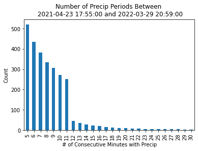
Determine our Event Duration Thresholds
As mentioned before, we are interested in finding consecutive periods of precipitation. The question is - how long of a period are we looking for? 5 minutes? 30 minutes? Let’s try out some thresholds, ranging from 5 to 30 minutes, investigating how increasing the threshold by one minute impacts how many groups we end up with.
group_sizes = np.arange(5, 31, 1)
df_list = []
for group_size in group_sizes:
good_groups = (df_extended.sequence_size >= group_size) & (df_extended.is_positive)
good_groups_df = pd.DataFrame({'time_threshold':str(group_size),
'group_size':len(df_extended[good_groups].sequence_group.unique())},
index=[0])
df_list.append(good_groups_df)
group_size_df = pd.concat(df_list, ignore_index=True)
Visualize our Threshold Value Options
It looks like there is a steep drop off (a lot fewer events) after 11 minutes - 11 minutes looks like the sweet spot before we filter out too many events!
group_size_df.plot.bar(x='time_threshold',
y='group_size',
xlabel='# of Consecutive Minutes with Precip',
ylabel='Count',
title=f'Number of Precip Periods Between \n {str(masked_gauge.index.min())} and {str(masked_gauge.index.max())}',
legend=False);
Apply our filter to the dataset
Now that we have our threshold, let’s apply this to our dataset. We filter for:
Events greater than 11 minutes in duration
Events with positive precipitation
precip_events = df_extended[(df_extended.sequence_size >= 11) & (df_extended.value >= 0)].sequence_group.unique()
precip_events.astype(int)
array([ 0, 2, 8, ..., 9962, 9966, 9978])
Now that we have our “precip_events”, let’s go back to an xarray.Dataset
We use a helper function to convert back to our xarray.Dataset
def create_dataset(df,
group,
disdrometer_precip_rate=disdrometer_precip_rate,
gauge_precip_rate=gauge_precip_rate):
"""
Creates an xarray.Dataset from a dataframe with identified groups
Parameters
----------
df = pd.Dataframe
Dataframe with the identified groups (sequence group) - see previous cells
group = float
Group number, identified by previous cells
disdrometer_precip_rate: xarray.DataArray
Disdrometer precipitation rate (mm/hr)
guage_precip_rate: xarray.DataArray
Rain gauge precipitation rate (mm/hr)
Returns
-------
ds_out: xarray.Dataset
Dataset for given group, subset with corresponding time and data values
"""
# Identify the group
df_event = df_extended.loc[df_extended.sequence_group == group]
# Grab the start and end time
start_time = df_event.index.min()
end_time = df_event.index.max()
# Grab the disdrometer values
disdrometer_values = disdrometer_precip_rate.sel(time=slice(start_time, end_time))
gauge_values = gauge_precip_rate.sel(time=slice(start_time, end_time))
ds_out = xr.Dataset({'disdrometer':disdrometer_values,
'rain_gauge':gauge_values})
ds_out['start_time'] = ds_out.time.data.min()
ds_out['end_time'] = ds_out.time.data.min()
ds_out = ds_out.set_coords(['start_time', 'end_time'])
ds_out['event_start_time'] = ds_out.time.data.min()
return ds_out
Loop through the different groups and create datasets
We loop through and do this for each of precipitation events, and merge into a single dataset
ds_list = []
for event in precip_events:
ds_list.append(create_dataset(df_extended, event))
all_events = xr.concat(ds_list, dim='event_start_time')
all_events
<xarray.Dataset>
Dimensions: (time: 411032, event_start_time: 1106)
Coordinates:
* time (time) datetime64[ns] 2021-04-23T17:55:00 ... 2022-03-2...
start_time (event_start_time) datetime64[ns] 2021-04-23T17:55:00 ....
end_time (event_start_time) datetime64[ns] 2021-04-23T17:55:00 ....
* event_start_time (event_start_time) datetime64[ns] 2021-04-23T17:55:00 ....
Data variables:
disdrometer (event_start_time, time) float64 nan nan nan ... nan nan
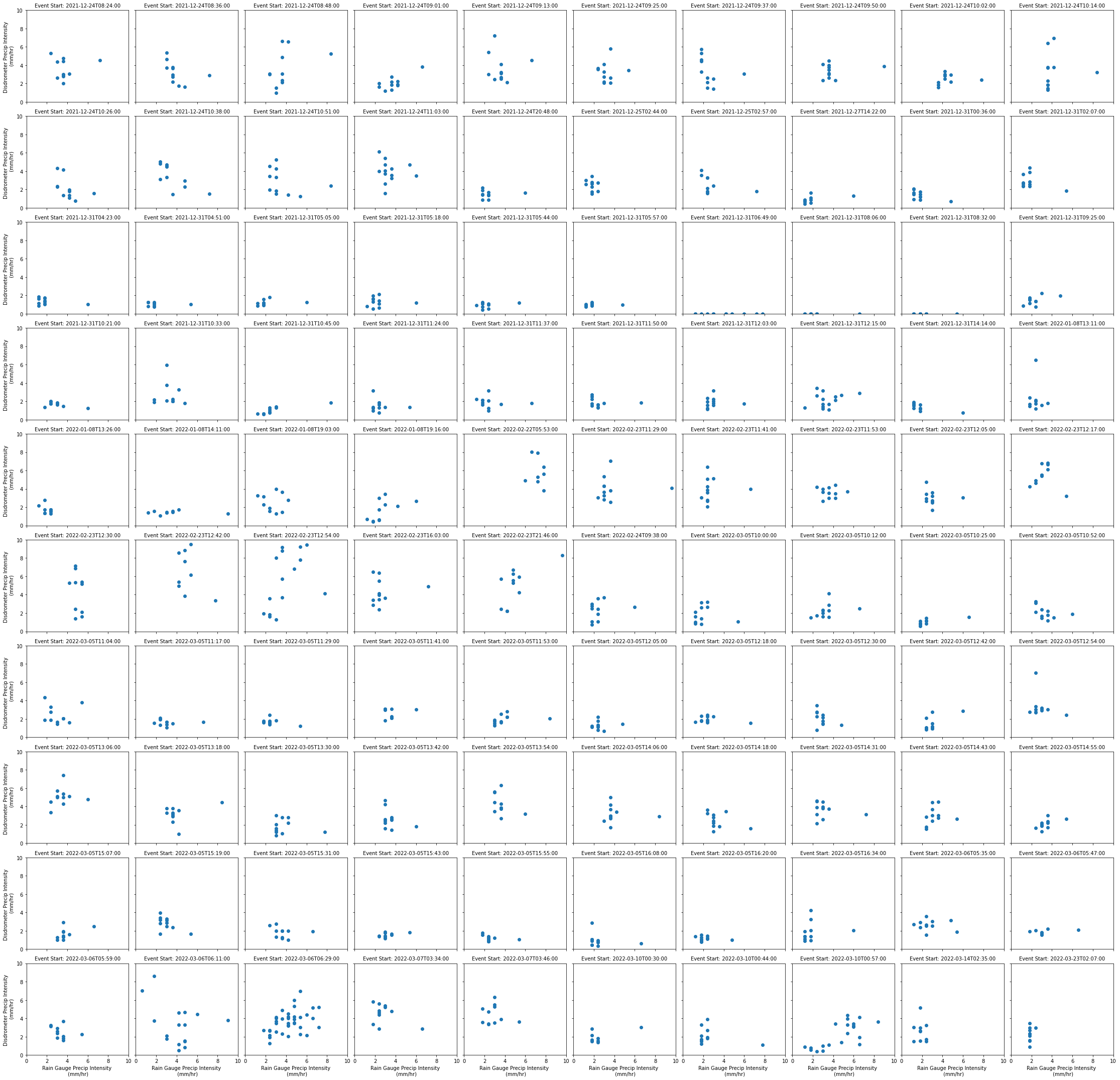
rain_gauge (event_start_time, time) float32 0.0 0.0 0.0 ... 0.0 0.0Compare Disdrometer and Rain Gauge Precipitation Values for Each Event
Let’s take a look at the last 100 events - how do precipitation rates for the:
Disdrometer
Rain Gauge
Compare with one another?
g = all_events.isel(event_start_time=range(-101,-1)).plot.scatter(x='rain_gauge',
y='disdrometer',
col='event_start_time',
col_wrap=10)
g.set_xlabels('Rain Gauge Precip Intensity \n (mm/hr)')
g.set_ylabels('Disdrometer Precip Intensity \n (mm/hr)')
g.set_titles('Event Start: {value}', maxchar=50)
plt.ylim(0,10)
plt.xlim(0,10)
plt.show()
plt.savefig('last_100_disdrometer_gauge_comparisons.png', facecolor='white', transparent=False);