X-Band PPI Analysis
Contents
X-Band PPI Analysis
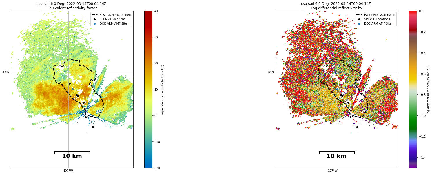
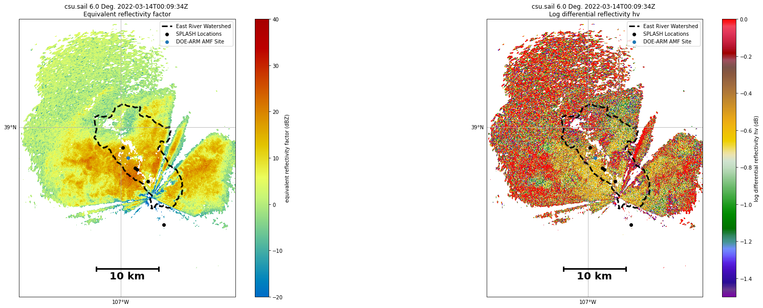
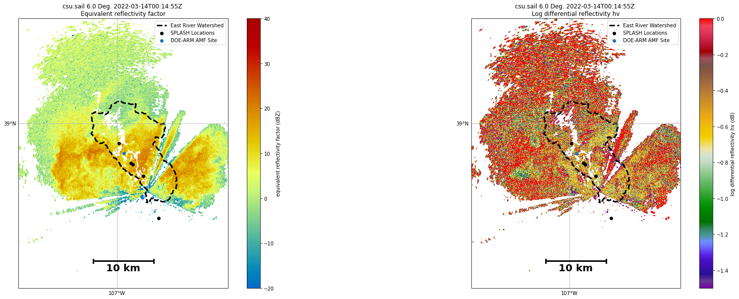
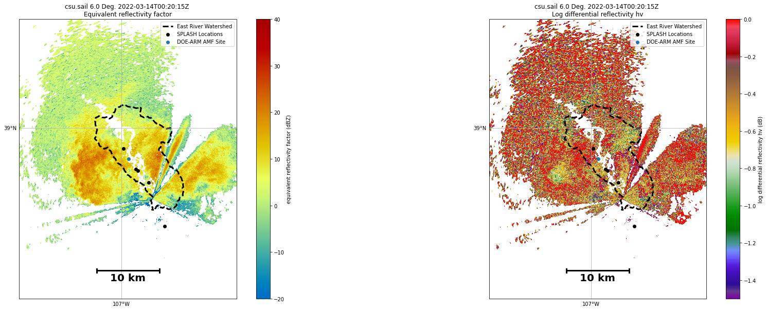
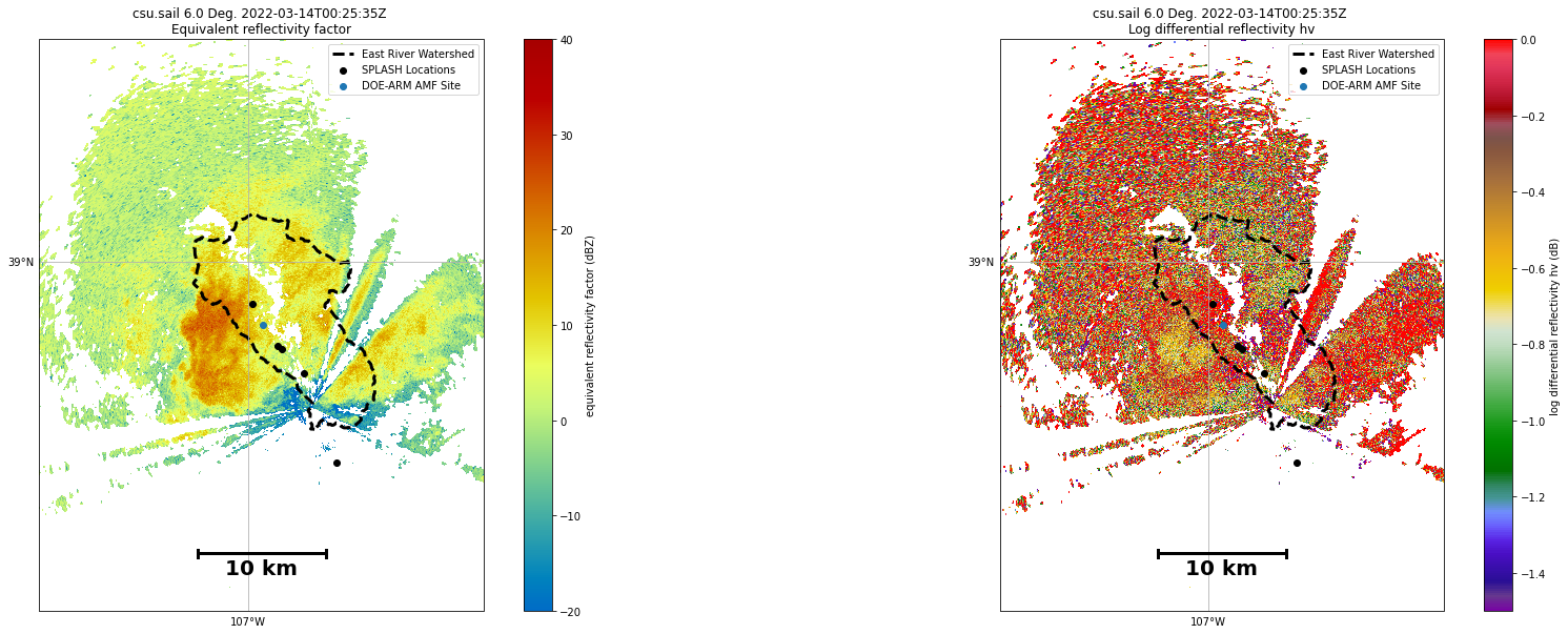
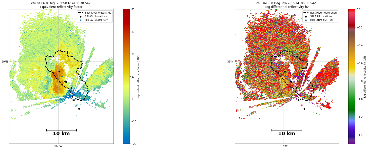
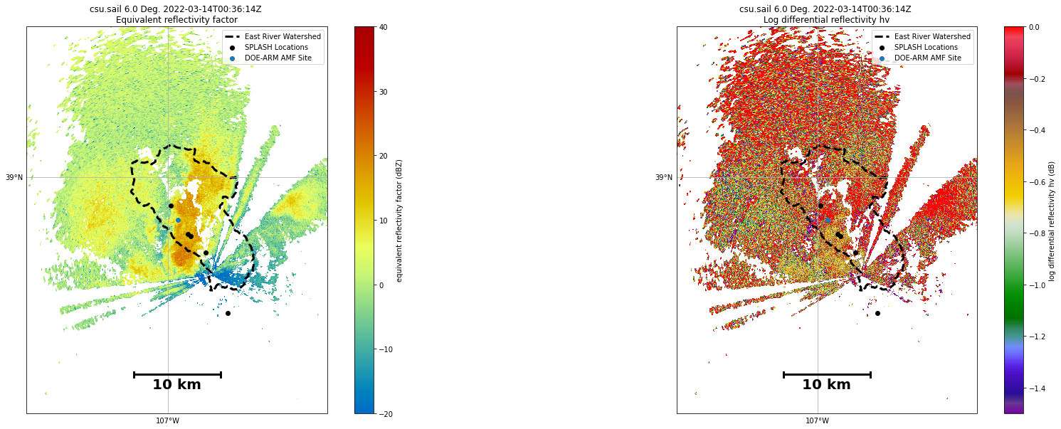
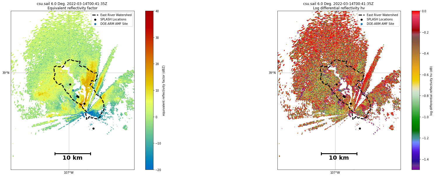
During this same analysis period, there was an X-Band radar operated by CSU scanning in both PPI/RHI scan modes
Imports
import pyart
import glob
import xarray as xr
import matplotlib.pyplot as plt
import cartopy.crs as ccrs
import numpy as np
from math import atan2 as atan2
import warnings
import hvplot.xarray
import holoviews as hv
import geopandas as gpd
import fiona
fiona.drvsupport.supported_drivers['libkml'] = 'rw' # enable KML support which is disabled by default
fiona.drvsupport.supported_drivers['LIBKML'] = 'rw' # enable KML support which is disabled by default
warnings.filterwarnings("ignore")
hv.extension('bokeh')


Data Overview
The data were accessed from the ARM data portal - here is a link to the specific query, with our date being March 14, 2022
We will be looking at the 6 degree elevation scan, since there is better data coverage in the clouds/less beam blockage due to terrain
Analysis Workflow
Read in the Data
We grab the files from the following directory, after ordering from the data portal and unzipping the archive
radar_files = sorted(glob.glob('../../data/x-band/ppi/*6_PPI.nc'))
Setup Helper Functions
We include some helper functions to build the scale bar for the plots
def gc_latlon_bear_dist(lat1, lon1, bear, dist):
    """
    Input lat1/lon1 as decimal degrees, as well as bearing and distance from
    the coordinate. Returns lat2/lon2 of final destination. Cannot be
    vectorized due to atan2.
    """
    re = 6371.1  # km
    lat1r = np.deg2rad(lat1)
    lon1r = np.deg2rad(lon1)
    bearr = np.deg2rad(bear)
    lat2r = np.arcsin((np.sin(lat1r) * np.cos(dist/re)) +
                      (np.cos(lat1r) * np.sin(dist/re) * np.cos(bearr)))
    lon2r = lon1r + atan2(np.sin(bearr) * np.sin(dist/re) *
                          np.cos(lat1r), np.cos(dist/re) - np.sin(lat1r) *
                          np.sin(lat2r))
    return np.rad2deg(lat2r), np.rad2deg(lon2r)


def add_scale_line(scale, ax, projection, color='k',
                  linewidth=None, fontsize=None, fontweight=None):
    """
    Adds a line that shows the map scale in km. The line will automatically
    scale based on zoom level of the map. Works with cartopy.

    Parameters
    ----------
    scale : scalar
        Length of line to draw, in km.
    ax : matplotlib.pyplot.Axes instance
        Axes instance to draw line on. It is assumed that this was created
        with a map projection.
    projection : cartopy.crs projection
        Cartopy projection being used in the plot.

    Other Parameters
    ----------------
    color : str
        Color of line and text to draw. Default is black.
    """
    frac_lat = 0.1  # distance fraction from bottom of plot
    frac_lon = 0.5  # distance fraction from left of plot
    e1 = ax.get_extent()
    center_lon = e1[0] + frac_lon * (e1[1] - e1[0])
    center_lat = e1[2] + frac_lat * (e1[3] - e1[2])
    # Main line
    lat1, lon1 = gc_latlon_bear_dist(
        center_lat, center_lon, -90, scale / 2.0)  # left point
    lat2, lon2 = gc_latlon_bear_dist(
        center_lat, center_lon, 90, scale / 2.0)  # right point
    if lon1 <= e1[0] or lon2 >= e1[1]:
        warnings.warn('Scale line longer than extent of plot! ' +
                      'Try shortening for best effect.')
    ax.plot([lon1, lon2], [lat1, lat2], linestyle='-',
            color=color, transform=projection,
            linewidth=linewidth)
    # Draw a vertical hash on the left edge
    lat1a, lon1a = gc_latlon_bear_dist(
        lat1, lon1, 180, frac_lon * scale / 20.0)  # bottom left hash
    lat1b, lon1b = gc_latlon_bear_dist(
        lat1, lon1, 0, frac_lon * scale / 20.0)  # top left hash
    ax.plot([lon1a, lon1b], [lat1a, lat1b], linestyle='-',
            color=color, transform=projection, linewidth=linewidth)
    # Draw a vertical hash on the right edge
    lat2a, lon2a = gc_latlon_bear_dist(
        lat2, lon2, 180, frac_lon * scale / 20.0)  # bottom right hash
    lat2b, lon2b = gc_latlon_bear_dist(
        lat2, lon2, 0, frac_lon * scale / 20.0)  # top right hash
    ax.plot([lon2a, lon2b], [lat2a, lat2b], linestyle='-',
            color=color, transform=projection, linewidth=linewidth)
    # Draw scale label
    ax.text(center_lon, center_lat - frac_lat * (e1[3] - e1[2]) / 4.0,
            str(int(scale)) + ' km', horizontalalignment='center',
            verticalalignment='center', color=color, fontweight=fontweight,
            fontsize=fontsize)
Configure our Main Plotting Function
We use the RadarMapDisplay from PyART as the main plotting utility, with a few customizations
def plot_ppi(file,
             centerlon,
             centerlat,
             other_field='ZDR',
             splash_locations=splash_locations,
             arm_doe_locations=arm_doe_locations,
             east_river=east_river):

    # Read in the data using pyart
    radar = pyart.io.read_cfradial(file)

    # Quickly qc data using velocity texture
    vel_texture = pyart.retrieve.calculate_velocity_texture(radar, vel_field='VEL', wind_size=3, nyq=33.4)
    radar.add_field('velocity_texture', vel_texture, replace_existing=True)

    # Add a gatefilter, and filter using a threshold value of 4 - could be refined
    gatefilter = pyart.filters.GateFilter(radar)
    gatefilter.exclude_above('velocity_texture', 4)

    # Setup our figure
    fig = plt.figure(figsize=(30, 10))

    #delta lat lon degrees
    window = 0.2
    locbox = [centerlon - window, centerlon + window, centerlat - window, centerlat + window]

    # create the plot
    ax1 = fig.add_subplot(121, projection=ccrs.PlateCarree())

    # Setup a RadarMapDisplay, which gives our axes in lat/lon
    display = pyart.graph.RadarMapDisplay(radar)

    # Add our reflectivity (DBZ) field to the plot, including our gatefilter
    display.plot_ppi_map('DBZ', 0, ax=ax1, vmin=-20, vmax=40.,
                         gatefilter=gatefilter)

    # Set our bounds
    plt.xlim(locbox[0], locbox[1])
    plt.ylim(locbox[2], locbox[3])

    splash_locations.plot(ax=ax1,
                          color='black',
                          label='SPLASH Locations')

    arm_doe_locations.plot(ax=ax1,
                           color='tab:blue',
                           label='DOE-ARM AMF Site')

    east_river.plot(ax=ax1,
                    facecolor='None',
                    edgecolor='k',
                    linestyle='--',
                    linewidth=3,
                    legend=True,
                    label='East River Watershed')

    ax1.plot(0,
             0,
             linewidth=3,
             color='black',
             linestyle='--',
             label='East River Watershed')

    plt.legend(loc='upper right')

    # Add our scale bar
    add_scale_line(10.0, ax1, projection=ccrs.PlateCarree(),
                   color='black', linewidth=3,
                   fontsize=20,
                   fontweight='bold')

    # Part 2 - plot either ZDR or PHIDP
    ax2 = fig.add_subplot(122, projection=ccrs.PlateCarree())

    if other_field == 'ZDR':

        # Plot ZDR, using the bounds discussed on Slack - notice the negative values
        display.plot_ppi_map('ZDR', 0, ax=ax2, vmin=-1.5, vmax=0.,
                             gatefilter=gatefilter,
                             cmap='pyart_Carbone42')

    elif other_field == 'PHIDP':

        display.plot_ppi_map('PHIDP', 0, ax=ax2,
                             vmin=90, vmax=120,
                             gatefilter=gatefilter,
                             cmap='pyart_Carbone42')

    # Adjust the bounds
    plt.xlim(locbox[0], locbox[1])
    plt.ylim(locbox[2], locbox[3])

    east_river.plot(ax=ax2,
                    linestyle='--',
                    facecolor='None',
                    edgecolor='k',
                    linewidth=3,
                    legend=True,
                    label='East River Watershed')

    # Add a point for the KAZR radar
    splash_locations.plot(ax=ax2,
                          color='black',
                          label='SPLASH Locations')

    arm_doe_locations.plot(ax=ax2,
                           color='tab:blue',
                           label='DOE-ARM AMF Site')
    ax2.plot(0,
             0,
             linewidth=3,
             color='black',
             linestyle='--',
             label='East River Watershed')

    # Add a scale bar
    add_scale_line(10.0, ax2, projection=ccrs.PlateCarree(),
                   color='black', linewidth=3,
                   fontsize=20,
                   fontweight='bold')

    plt.legend(loc='upper right')

    # Create the image path from the time
    image_path = f"../images/xband_ppi/xband_ppi_{radar.time['units'][-8:].replace(':', '.')}.png"

    # Make sure it has a white background - helps with dark mode in slack
    plt.savefig(image_path, facecolor='white', transparent=False)

    # Show the figure, then close!
    plt.show()
    plt.close()
Test the Plotting on a Single File
Let’s test out this function on a single file…
We also need to read in the lat/lon of the different instrumentation sites
splash_locations = gpd.read_file('../../data/site-locations/SPLASH_Instruments.kml')
arm_doe_locations = gpd.read_file('../../data/site-locations/doe-arm-assets.kml')[:1]
east_river = gpd.read_file('../../data/site-locations/East_River.kml')
plot_ppi(file=radar_files[0],
         centerlat=lat,
         centerlon=lon)

Final Data Visualization
Let’s plot all of our files!
for file in radar_files:
    plot_ppi(file, centerlat=lat, centerlon=lon)